Seeing the new (old ) ui just makes me want one more thing…for them to make a reversion on lore. And I wasn’t even heavily into lore, not that it didn’t interest me a bit, just never took the time to look into it. But a game this unique and beautiful needs its lore back!!!
They could easily fill in lore for all the heroes that don’t have it so far.
And if they ever did do a different 5v5 map, like non mirrored, lore would be a great way to introduce it! I always found the snippets of lore I caught interesting even if I never bothered to look everything up on the main site.
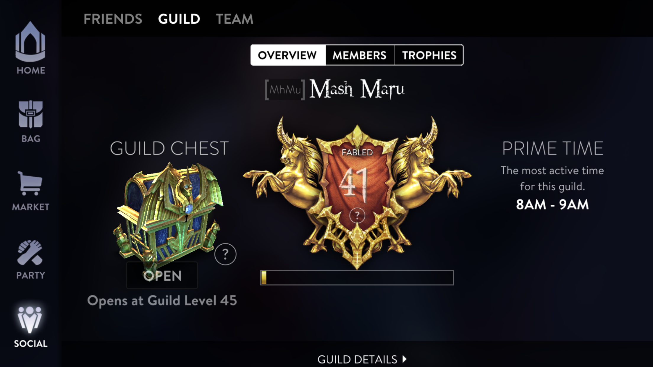
Overall, the UI looks great, asthetic and function-wise. Great contrast, good visuals, easier to navigate and it’s easy on the eye. (I also think the now-old UI wasn’t very thought out by SEMC). This is an upgrade. A great Philosophy in intuitive design is that “if something works well, you wouldn’t even know it’s working”- navigating and using it should become second-nature. I hope SEMC could reach that level in the next update.
SEMC shouldn’t have changed the UI in the first place (the OG UI was iconic). That change didn’t enrich the experience in any way and it surely cost some time, money and effort.
I agree. I liked the old aesthetic as well. But the latest iteration is FAR superior than the previous one, which as has been pointed out numerous times, was horribly generic.
I just wish they’d actually FINISH the UI changes – the UI has been a mishmash for what, 18 months?
I like this UI a lot too - they’ve done really good work in the past versions to clean up the actual navigation, and now they’re bringing the visuals up to speed too. I’d adjust the play button a bit, myself, but they’ll get there.
They are just fixing the tip of the ice berg (ie Homescreen) for now, a unified UI would take 3-5 updates I’m sure. It’s better for them to stop and think to guarantee perfection, rather than rushing.
Hope they would bring back the Live Animation Wallpaper, those looked great, and all devices should be able to handle it, considering there was no intense rendering. As of right now, we have to deal with a blurry Kestrel.
I think they could work on making the play button mesh better with the background. Their color choice is already great, but animating it a bit and darkening the red colors could make it look natural to the current environment instead of sticking out like a sore thumb with the white border and overall flat image. Other than that the UI is a massive improvement
 But I just had to let it be known that they newest and current UI of today is truely the best thing Ive seen.


 ) ui just makes me want one more thing…for them to make a reversion on lore. And I wasn’t even heavily into lore, not that it didn’t interest me a bit, just never took the time to look into it. But a game this unique and beautiful needs its lore back!!!

