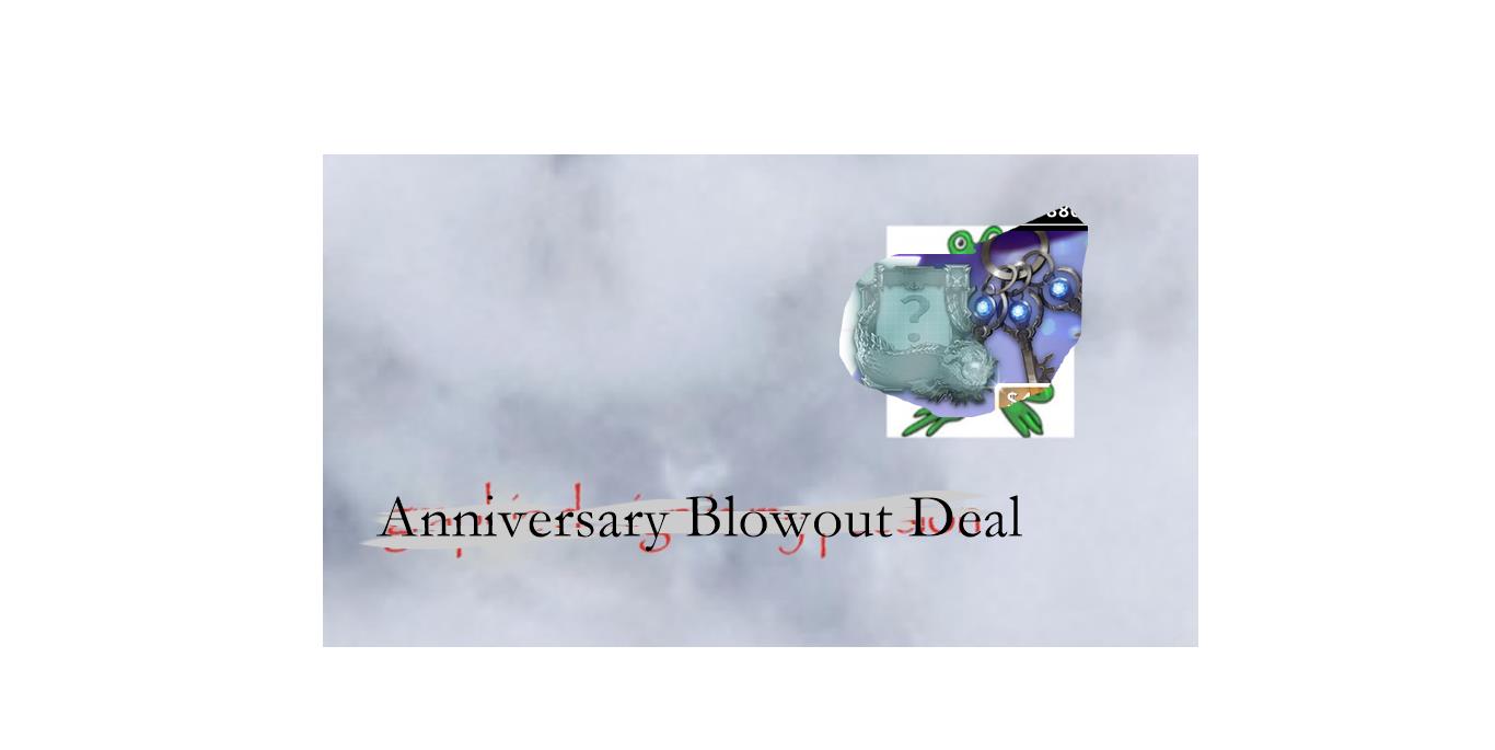
I’ve always thought that some of the fonts and bevels they used to promote their new skins were kinda cringey, but this is UNACCEPTABLE lmao.

This is probably a bug, but yikes.
I’ve always thought that some of the fonts and bevels they used to promote their new skins were kinda cringey, but this is UNACCEPTABLE lmao.
I would waste money on the first deal but I also feel like I’ll be quiting the game soon so I don’t know.
I’ve seen PowerPoint presentations that look better than that.
The reason it’s like that is because the amount of text that takes up the space varies by region/language.
But yeah, it looks like doo doo.
google powerpoint presentations. 
Cmon guys they are trying to make money… like always.
I don’t like the font, but it wouldn’t really change if I were to get the deal or not - I don’t buy in app purchases or micro transactions. Never have, never will. (Even if this wasn’t true the it would not)
You can only do so much.
Well Vainglory, known for their superior graphics, can’t design an eye-blowing menu. 
The art/graphics are one of the main reasons why I like vainglory, I think it would be cool if the made an amazing looking menu.
Yeah nah all those different fonts they use on skin releases now just don’t fit either…
ikrrrrr like that shit looks photoshopped real badly
Are you saying Vg is trash ?because its not