
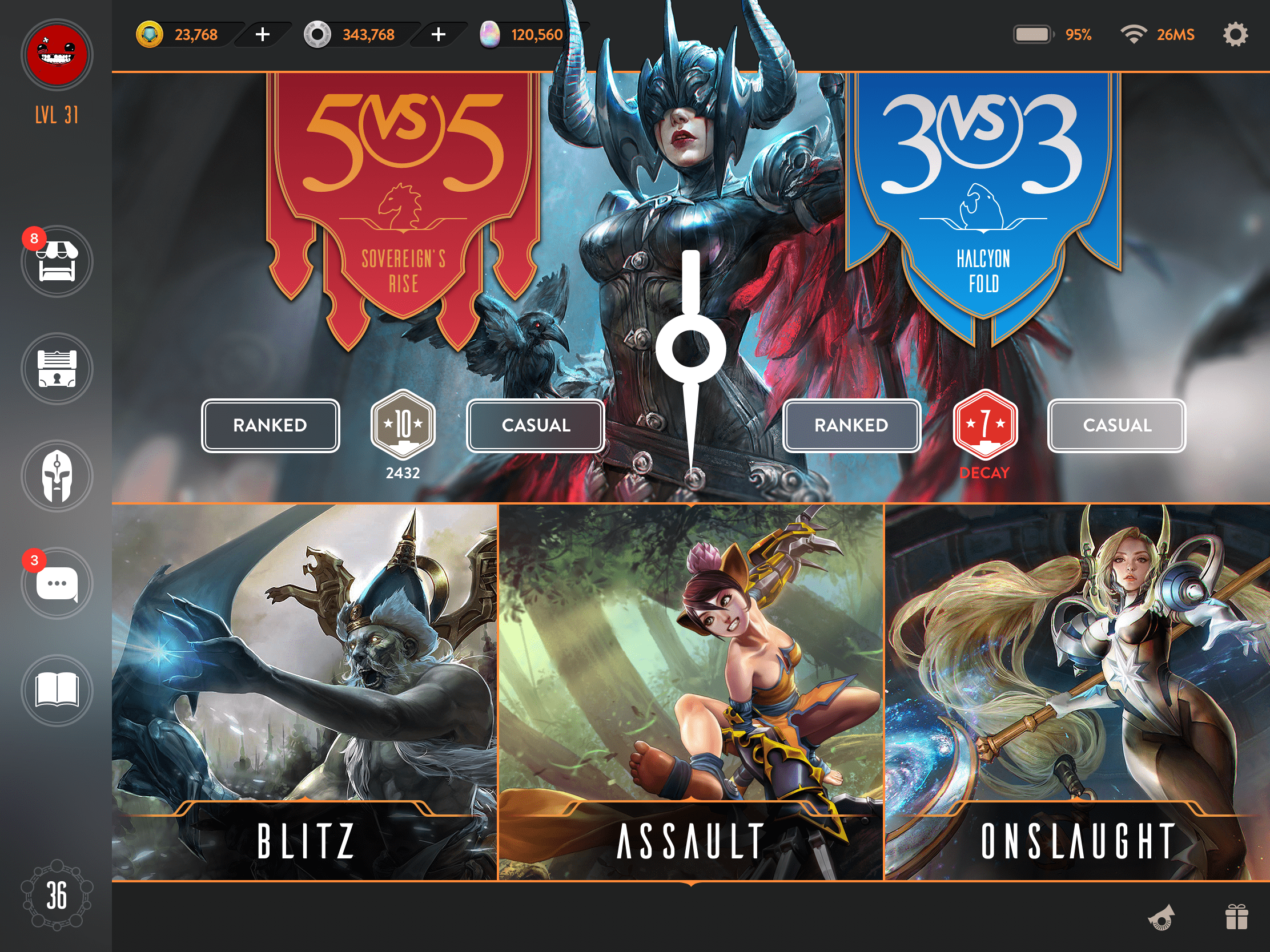
A small teaser of my UI reboot. I’ve been working on this project for some time… spare time permitting. Stay tuned.
18 Likes
I like it, but hero icon is still bing-bonglike
2 Likes
I like the overall layout a lot, my suggestions would be relatively small. Things like-
The text aside from the game mode names, looks a bit small to me. Some people would be viewing this on their phone. However, just seeing all the game modes and the game start buttons and elos, is a lot more appealing to me than the current or previous modes. When a match que is started, would the relevant button just go “click”? Then you just need a tiny popup up top, and a recolor of one button.
The middle icon, is that intended to be a head with a brain? It looks a little unclear to me personally, but I assume this is the Academy?
I have no issue with the hero icon. Its a helmet. I really don’t care if it looks like an icon from another game. That should not be very important.
Tapping a play button (whether brawl mode, or ranked/casual) will present a new window. We need a place to show queue time and for bot matches, select difficulty, etc.
Employing a small pop up would be lost in the sea of information, which as you point out, is quite dense already.
This is well thought out and a fantastic step forward compared to the UI we’ve got now. I’m a sucker for the frosted glass look, so the buttons are top notch in my opinion. The accessibility of all playstyles being front and center, behind no other menus is perfect. I appreciate the “decay” indicator, that’s a wonderful touch.
Literally my only gripes are:
- the “5vs5” and “3vs3” font stands out from the rest of the UI and looks out of place, it doesn’t feel like the rest of the design.
- the gray you’ve chosen is on the “warmer” side, or so it appears - I assume to closer fit with the orange. Personally I’d go with a different set of colors, or stay away from the warmer side of the spectrum entirely. If there’s a reason why you particularly went with it, I’d love to know though.
All in all, excellent work. Looking forward to seeing more from you.
1 Like
Sooooooooo much better than the current direction the SEMC UI team is going! My only quibble is with the 5v5 and 3v3 typeface looking inconsistent with the face used on the rest of the interface, as was mentioned above. Obviously you are still tweaking it, but wow, what a fine state it’s in right now! Bravo!
1 Like
I’m a fan of the warmer end of the spectrum here, fwiw. I don’t particularly like very cool schemes for UIs … they seem off-putting to me.
1 Like
I think my similar feeling to this is stemming from the gray almost having a brown hue to it, or at least it feels like that, close to the orange. By no means is it a bad combination of colors. If this was the UI we got I’d much prefer it over what we have now.
Thanks for the very thoughtful reply dream. The skill tier markers have a few little embellishments to help players. As you’ve noticed, they show decay. Aside from that, they also take on their respective skill tier colors (bronze, silver, and gold) depending on the Elo. Additionally, once draft becomes available (skill tier 7 I believe), the lil stars become visible.
The 5v5 and 3v3 headers are the hero font. There is typically 2: One for the headers/titles and one for the text/base UI. Blitz, Assault and Onslaught (as well as things like a hero’s name in the rest of the UI) all use this font. In terms of appearance, they will likely be graphically enhanced. I’m thinking hanging banners make the most sense here. I’m being careful not to overdesign them. The screen is already graphically heavy thanks to the beautiful VG artwork. They may stick out now, but it’s clear to the player which mode is which. But that area is far from finished.
The main menu is still very much under active development. I have updated it since this pic, revising some of the icons, and including a flow I’m finally happy with it (let’s just say the shop or market actually looks like one!)
The colors were selected for reasons that have been touched on by hazeleyes. The warmer spectrum is just that: warmer. It feels softer and more inviting. But from a pure UI/Ux standpoint, we often game in the dark. Most of my gaming is done in low light. We often game in the evening, closer to bed. Not always but the trend is to game on the tail end of the day, not the beginning. The human body deals with warmer colors much better at night or later in the day. Firstly, they don’t burn out the rods in your eyes (this is why submarines flood their enclosures with red light), the cells responsible for night vision. Secondly, it’s been shown that adjusting the hue to the warmer spectrum before bed results in better sleep. Apple has included Night Shift because of this. There will always be more colors in the game, and those colors will run the gamut, but having a harsh and cold UI works counter to the above.
The aesthetics of the menu background are still very rough. The trim gives it the impression of debossing, which is not what I want. The menu is an overlay, so the design should reflect that it is on a plane on top of the rest of the UI. It will likely go through radical changes before I deem it finished.
It’s hard to tell from the screenshot, but the main background actually has a texture to it (it is much more visible on the hero compendium) and it’s color spectrum is far cooler than the rest of the UI (just to give you an idea of just how far: #242529).
2 Likes
You’re welcome, and thank you again for sharing the design with us, it’s obvious you’ve put a great deal of thought and effort into how it displays information and how immediately accessible that information - and the game - is.
Might I suggest that, because they are designed to show skill tier colors, that the decaying skill tier could show the color of the tier it’s currently occupying / what it’s decayed to - and then retain the red “DECAY” message. Maybe even a red arrow or something to signify that there in fact has been a decline in rank since last checked?
It’s not bad by any means, I want to stress that again. I do appreciate it, and I like it, and with your further explanations I see it in a different light (excuse me) and by that principle I could say I enjoy it even more now. I think harsher, cooler colors would be beneficial maybe in a sense that you’d want the users to wake up and play the game when they opened it up. Subconsciously it might further pique their desire to play with that tiny spike of awareness it seems to deliver. That’s at least the best way I can describe it, when I turn off night shift. (Was also an avid user of f.lux, I think it’s arguably better). I did not know about the rods in your eyes being burned, that’s extremely interesting that you’d put that much care into the app design. Kudos.
As for the texture, won’t lie, I noticed it right away, not sure how I feel about it but I certainly don’t dislike it. I’m usually at an odd stance with textures, because on one hand I’m a sucker for the cleanliness that is a texture-free, flat surface appearance. On the other hand, not done right, that can be so underwhelming and inherently boring that it’s detracting from the overall UI.
The longer I look at the main points of focus in this design, such as the 5vs5 / 3vs3 section and the artwork, it almost looks to me as if this entire panel / slate of the game modes and their buttons is hovering over the rest of the UI, almost like a window on a computer screen with the shadow behind it… and I gotta say I really like the way that feels, a lot. Can’t put my finger on it, it’s not a debossed look but it has a floating aspect.
As for the font for the 5vs5 / 3vs3 , I thought about it, and I think the reason why those numbers in particular bother me is because they look like a serif font, whereas the remainder of all the text bodies are sans-serif.
I can’t wait to see what’s to come, I definitely have a much broader idea of your approach and it’s got me looking forward to your next post.
3 Likes
make it koshka head icon or skaarfu icon
1 Like
I don’t really know the protocol for updating threads of this nature. So I’m going to tack the revision as a reply and hope people don’t just skim the first post, rather than edit the initial one as that would knockout most of the comments that many people put a lot of time and effort into.
Here is as close to the final draft as I’m going to reveal. There are still some graphical embellishments that need doing and some additional icons and features that need embedding, but I’m mostly happy with this screen (till I wake up tomorrow and gut it because it’s complete shit).
Hopefully now the cursive font makes a little more sense, thematically. Aside from aesthetic changes that I feel lend better to the overall feel of the UI, I’m planning on adding a Gift feature. VG has always lacked a way to gift other players things (skins, golden tickets, ice, etc.). Even when SEMC gifts us items like Catherine’s SE skin for Worlds, it just shows up. Wouldn’t it be nice if you were notified when you received it? How about waking up, logging on and seeing a notification badge on the gift icon. You tap it, and see that you won 500 ICE or received 2 epic keys for competing in their latest Twitter competition. Well, Tiem’s got you boo.
The banner’s for each mode will likely see some changes but overall I’m quite happy with the base.
From top to bottom on the side menu: Shop, Quests, Hero Compendium, Chat/Party and Wiki. The Wiki has been under development for some time and will include much of the information that is scattered around the net. There will be anything and everything in there to satiate the beginner to the most hardcore advance player. Also item catalogue. Yes, you no longer have to fire up a private solo match to see how much slow is applied via Shiversteel. My aim is to have this dense information organized and laid out in a user friendly manner.
As always, thanks to everyone who has offered feedback. See you in the fold!
4 Likes
A lot of Ux is about trade offs. Your suggestions for the decay feature are great. But would add quite a bit of cognitive overheard. My aim to show decay is to communicate that state to the player without an additional taps to their profile. If they do see they are decaying a quick tap to their profile will show them all the relevant information. None of which is all that important to this screen however. It’s always better to try and anticipate the patterns of the player (or a user in general) so you can keep things simple and clean without having them jump through additional hoops. That’s essentially the trade off in every UI. And the reason we employ things like pagination and parent options that drill down further into children rather than just tossing it all in one spot.
Additionally, text isn’t the best indicator. Lots rely on it exclusively, but it’s always better to have a secondary state to amplify the message. Here we use color that is distinct from the skill tier spectrum. The skill tier number remains so they do understand where they are to some degree (as opposed to wiping out the entire skill tier and throwing up an icon to illustrate decay). That’s the balance in the trade off. At a glance, they see “hey, I’m still T7 but may have dropped it a bit of Elo”. Naturally if they were T10 and came back after a month and saw T5, it wouldn’t matter much if they were T5 silver or gold.
I’m glad you caught the depth. It is something I’ve been incorporating into my designs for a while now. The new revision goes back to these roots and I feel tends to work better across the entire UI than its predecessor.
I think the number one criticism agains the screen was clutter. I can see why coming from the stark design of VG. I have teased out some elements that I feel were redundant and while I suspect most will still say there’s too much going on, I feel it’s getting close. I will continue to look at ways to reduce cognitive overhead but I feel I’m pretty close as we stand.
Thanks again for the comments <3
Which would win?
A gaming company backed by numerous investors who are the leaders in the field of quality mobile MOBAs.
One Teim
1 Like
This is just brilliant. Have you considered muting the Storm Queen image a bit – maybe by adding a slight blur or by desaturating it slightly? I feel like it is competing with your mode graphics just a bit.
(I realize that’s somewhat ironic, given some of the feedback about this site’s bg being too prominent … revisions soon there!) 
I’ve actually included an iris blur on the queen (you can compare my pic with that of this forums to spot the difference). I wanted to avoid desaturation to attenuate her because it makes the area feel dead or disabled. I also use that effect to communicate the following screen (when a user commences a queue) so it would break the transitional effect.
I’ve back tracked a bit on this screen actually so it has changed some. Never happy. That’s my problem. I’d keep designing this till I die if I could lol.
<3
Lol, I do know that trait very well. Fwiw, I love seeing the explanations that inform design decisions – reading them helps me improve my own design sense. Thank you for sharing – and look forward to more!!!
1 Like
Great explanations, and I understand the points you’ve made. Makes more sense, again.
I looked at your revised design and I see the panel on the very left has adopted the frosted glass appearance, and obviously the big change is the banners. I quite like the banners, though they give me the impression of paper or card - and that’s not really a bad thing per se - but they do have the appearance of being very flat. But those game mode choices stand out so much more. And that’s extremely important.
I also notice you removed the curved lines surrounding the different borders. Looks nice, honestly.
Good stuff, I’m really enjoying these watching this evolve.
1 Like
Yes the banners have not been “shopped” just yet. They are effectively the base of the design. I’m trying to be careful in how much detail they will get. The flat aesthetic is still very much alive and I don’t want to deviate too harshly from that paradigm.
As I’ve been working on this, there are always things that fall off the mark. Just like writing. Sometimes you write the best sentence ever, but it truly has no place in your argument or story as it drives nothing. Good writers remove them (it hurts, but ultimately it’s for the best).
I’m throwing up another revision with a simpler approach to starting a match, for every mode. The previous flow just didn’t work well considering how many different modes we have (bots, solo bots, practice, etc.). It should actually be a lot less dense as well.
Just of note, the BRAWL MODE title space will change. I’ve spent all of today trying to work it and came up with absolutely nothing of value. Bad design day. Damn. So yeah, that area sucks and I know it sucks. For anyone that’s like “yo Tiem, that area sucks.” Just try not to look at it for now. I’ve thought about juggling it off, but the modes really do need a title or else it’s going to confuse lots of the new players.

1 Like
