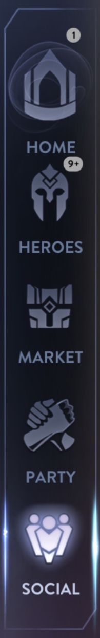

I only dislike the new Party icon. It looks off.
There’s a ton of new UI changes scattered around that I don’t think they mentioned. Or maybe I just missed the announcement. Overall improvement I’d say. But it was a surprise “I Spy” when I first redownloaded. 
I’ve noticed that the heroes’ portraits in the Heroes section have a subtle “transparaent to black gradient” now too.
Just glad trophies are gone from character tabs
Is changing the heroes icon to cute lil skaarf hard 
The NEW red banner on Anka also looks good.
I really don’t like the green “free hero” icon on hero select screen. It clashes very badly, the white was much nicer looking.
Catherine looks different in draft mode (portrait).
The black background is souch better than the old blue one. Really appreciate that change
yeah she looks like some fat balloon
i think they cleaned up the portrait of catherine on the hero page because it looks different from her splash art 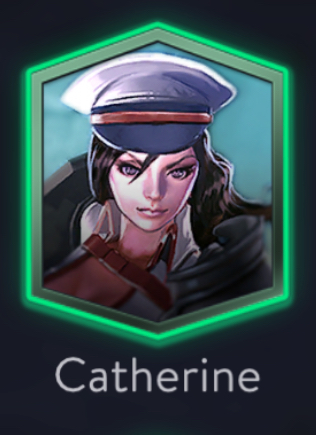
The lighting for the portrait is also much brighter than last patch