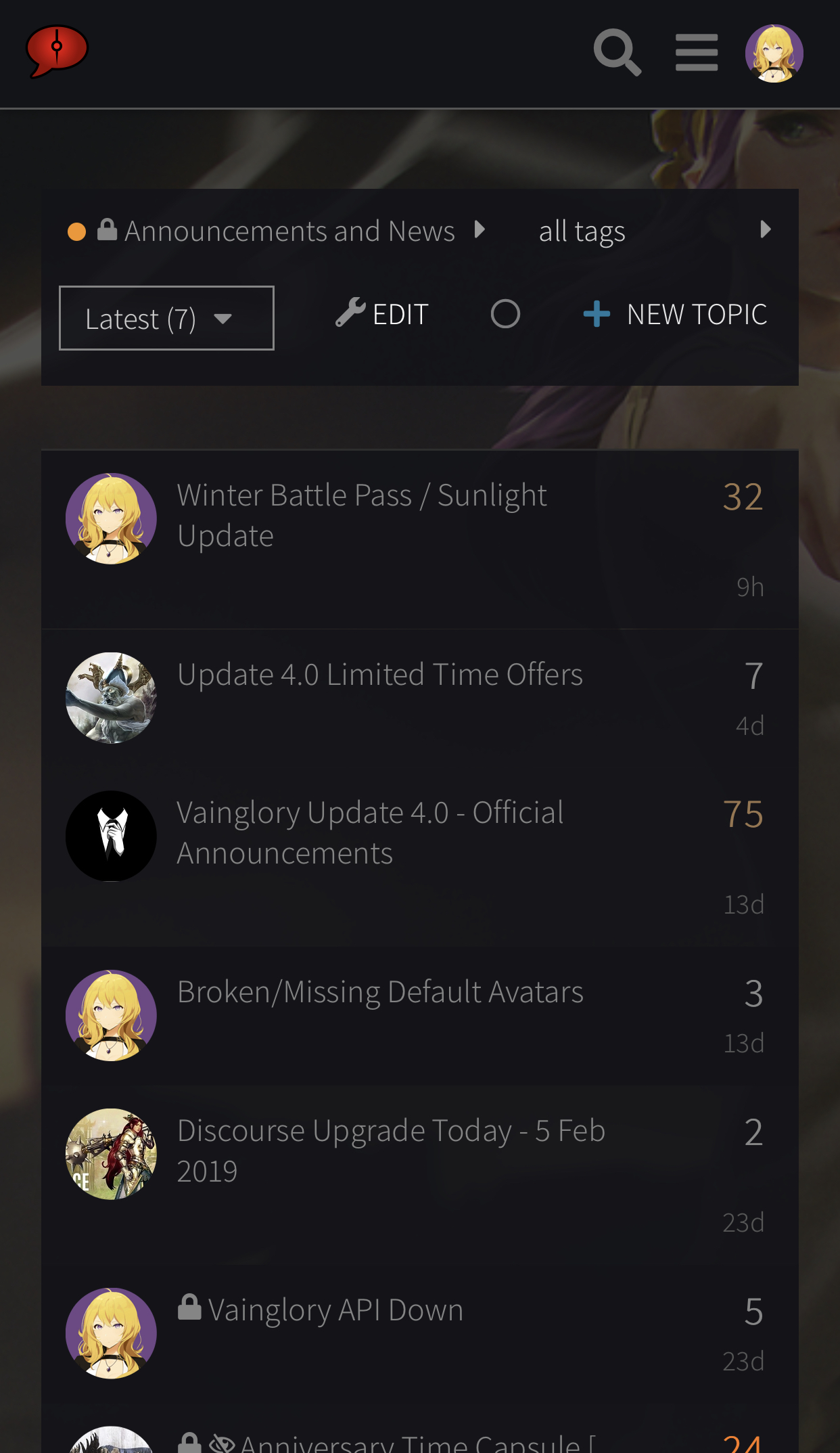
I’m considering adding a small toolbar to the mobile version of the site with the goal of making navigation a bit easier. Here’s a comparison (1st image is our standard mobile theme, 2nd image has the toolbar component added):
I’d appreciate feedback from folks that access the forums from their phones – is this something you’d find useful? Feel free to test it out by choosing the temporary “Mobile Test Theme” from your user preferences, then post your opinions here!
I like it in theory, but it’s not super useful for me, personally. I don’t drill down into my messages, bookmarks, profile, or preferences very often, so I don’t really need a shortcut. And for home, I just tap the logo. I’m also getting a strange interaction where I have to tap the toolbar to ‘prime’ it, then tap the button again to go to that destination. So it’s two taps anyway, like tapping my avatar then the destination. If I’ve primed the toolbar with one press, and don’t tap anywhere else, I can cycle between the destinations, but that’s not the intended use case I think. Not sure if other devices have the same experience.
Another quibble - it interacts with the discourse wrapper a bit strangely too - when I’m scrolling down, it displays fine, but when I scroll up, the wrapper appears and swallows the toolbar.
Toolbar primed (tapping once wakes up the toolbar but doesn’t go to the destination:
I don’t use those features often, but, that would certainly make it easier to do so if I wanted. I also find it to be a fine addition aesthetically speaking. I’d be in favor of it.
Not only does the address bar (on ios) and the top bar for the forum page takes up space, but having the bottom utility bar (for ios again) AND having a next bottom bar for the fourms really does take up alot of space.
My phone is a IP7 s Plus and thats already a huge screen.
That was my impression as well, even on my iPhone XS Max. If people find it helpful, it might be worth the space, but I guess we’ll see as more folks give it a try.
I wouldn’t find it useful, gotten use to how the layout is already and I’m fine with it myself but for others it could be useful. Guess optional thing on mobile if that’s fine would be fine if others are for it
I mean, it does make it simpler to get around the site on mobile, but I don’t really need it as I know my way around the site well enough to be able to find all these pages using other methods. I prefer the extra screen space (even if it’s just a little bit) and I’m less likely to accidentally tap onto a different page and lose where I was.
On the other hand, there’s no real reason not to have it, especially if it’s optional, I can see how it would make things easier for new users.
Okay, folks – the sentiment here seems to be mostly against including the icon/tool bar on mobile. Thanks very much to those who tested it out and offered their opinions!
I’m going to set this topic to auto-close later today, but anyone else who wants to try it out and share any feedback is welcome to do so before then!

 - it interacts with the discourse wrapper a bit strangely too - when I’m scrolling down, it displays fine, but when I scroll up, the wrapper appears and swallows the toolbar.


