Archived from the original VG forums posted by @Xhaos
Archived by @OneEyeOpen
Thank you @Vincitoria and @idmonfish for helping me make this thread!
Disclaimer: Please treat this thread as a mere suggestion. Just consider this as a “visual brainstorm”.
I. Homescreen
II. News Panel
III. Quest Room
This is a screenshot of Update 1.09 in my iPad I took last June 18, 2014.

Clearly, it’s a huge contrast to what we currently have.

It’ll be three years since I took that screenshot soon. It’s fascinating to see how much VG has grown since then. Because of all the new content, things can be a little hassle to navigate- which is why I appreciate our current home screen. You can say it’s cluttered, but you can’t deny that it’s convenient. I also admire the simplicity that the old home screen provided. So basically, this thread is an attempt to achieve the Best of Both Worlds ™® :oldskoolParty: This is just how I personally would like to see the home-screen.
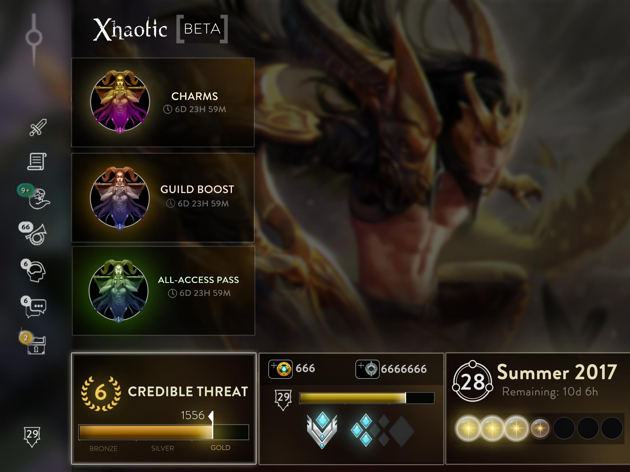
HOMESCREEN

-
Splashart Background – This visualization was centered around the premise of showing off SEMC’s bbyootifull splashart. Nothing else to say here. Additional note: I was going to go with SAW’s Elite Force skin, but I liked this BF skin better. (I just realized something as I typed this. SHUSH, you perv!) Say “Force Skin” a couple of times lmao Im mature haha hahhaaaahha111
-
Rank Box – The former screen showed off the Sunlight level and amount. It was convenient in a way that I knew my Sunlight level progress almost all the time; but in my opinion, rank is more relevant to show than sunlight. You can see this at the bottom-left corner of the screen. There are faint outlines on it to indicate its expandability.
-
Expanded Information – Tapping on the “Rank Box” shows you an array of valuable information:
-IGN
-Guild Tag
-Boosts (someone got lazy in finding different icons, so pls d0nt fl@me me)
-Elo
-ICE + Glory
-Daily Wins thingy (I don’t know its official name ooops)
-Sunlight-related Information -
Vainglory’s Name – It’s not as necessary, but it feels welcoming for me.
NEWS PANEL
I wanted a Panel that delivered news without being too intrusive of screen space.
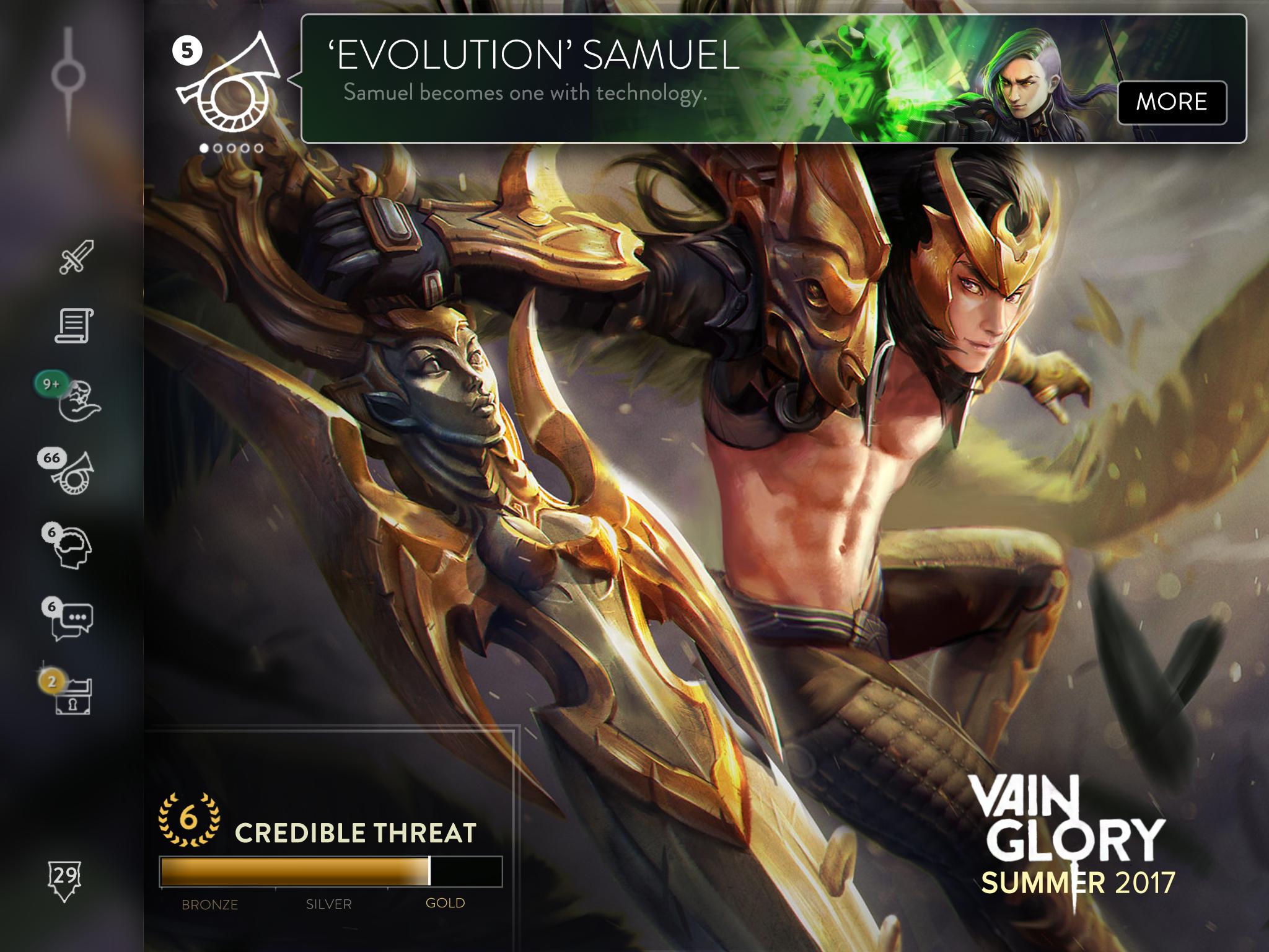
There will be an enlarged version of the News Trumpet in the upper-left corner of the screen. When you have “unread” News, a panel will appear right beside it whenever you enter the home screen. Perhaps if you have 5 unread news (like the example above), you can scroll sideways through them. Scrolling through all your news will stop the panel from appearing automatically whenever you enter the screen. So, when a panel appears in your home, It’s Definitely New News™®™®. Having read your New News ™®, the trumpet stops glowing and no longer does it show a number beside.
QUEST ROOM
If you were wondering where Quests have gone (If you weren’t wondering… uh idk- you should be), here they are! The room is divided into three (ignore “Badges/Titels”):
- Quests – This section is where Daily Quests and Regular Quests reside.
- Veteran – This section is where Long-term, grindy Quests are.
- Completed – All your completed quests belong here.

The Quest Room features 3 daily quests, and X number of regular quests. At the top are the Daily Quests that follow of theme of “just simply playing”. Since there’s a chest that gives out Talents, I wanted a chest that caters to skins as well; perhaps it gives a bunch of essence, cards, and opals. This gives the opportunity for Opals to actually be grindable (not sure if it isn’t though). The 3rd chest is unknown, hence the “?” I just really wanted three Daily Quests.
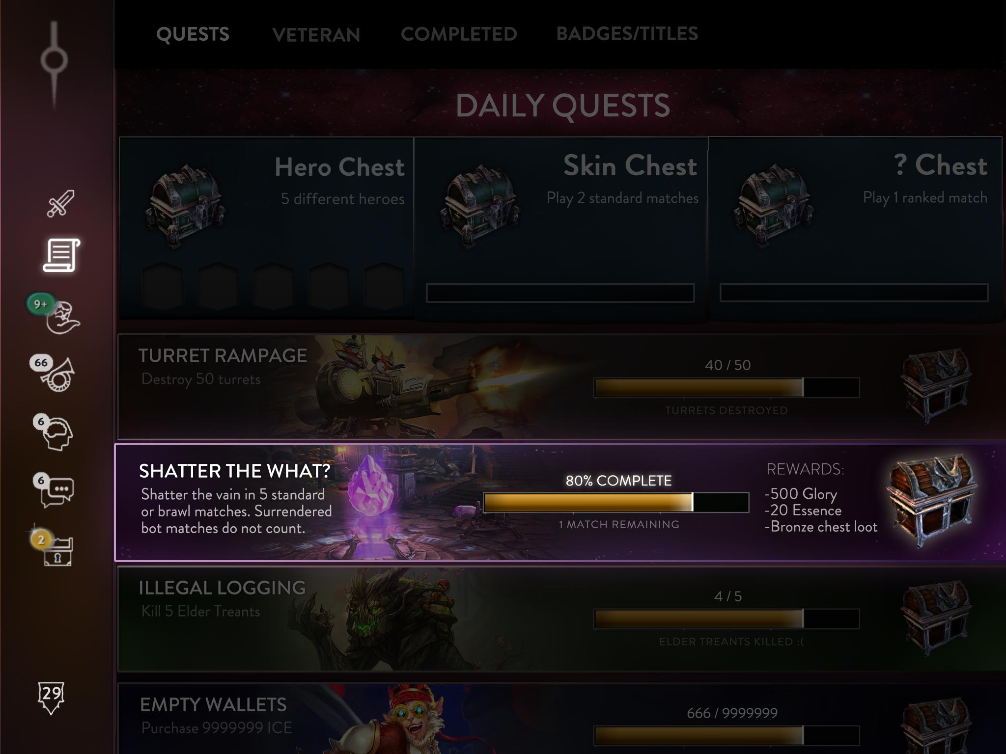
Pressing a Quest enables you to see a more detailed description of the Quest. You can see the completion’s percentage and rewards. This time, quests are both RNG and “fixed”. A quest can give a specific amount of glory and essence, while still having an RNG aspect.

The Veteran Quests. Hi, Reim. Bye, Lyra- you aren’t D A D D Y enough to be the spotlight of Veteran Quests. These are basically the grindy, long-term tasks that both Veterans and sKrUbZ can participate in! The rewards must be something really grind-worthy (Opals & ICE perhaps?). The quests that I wanted to show weren’t possible because Google Images can only provide so much. Have a Petal reference OG players understand and an Ozo goof instead. (Oh when seeds could heal without exploding them~)
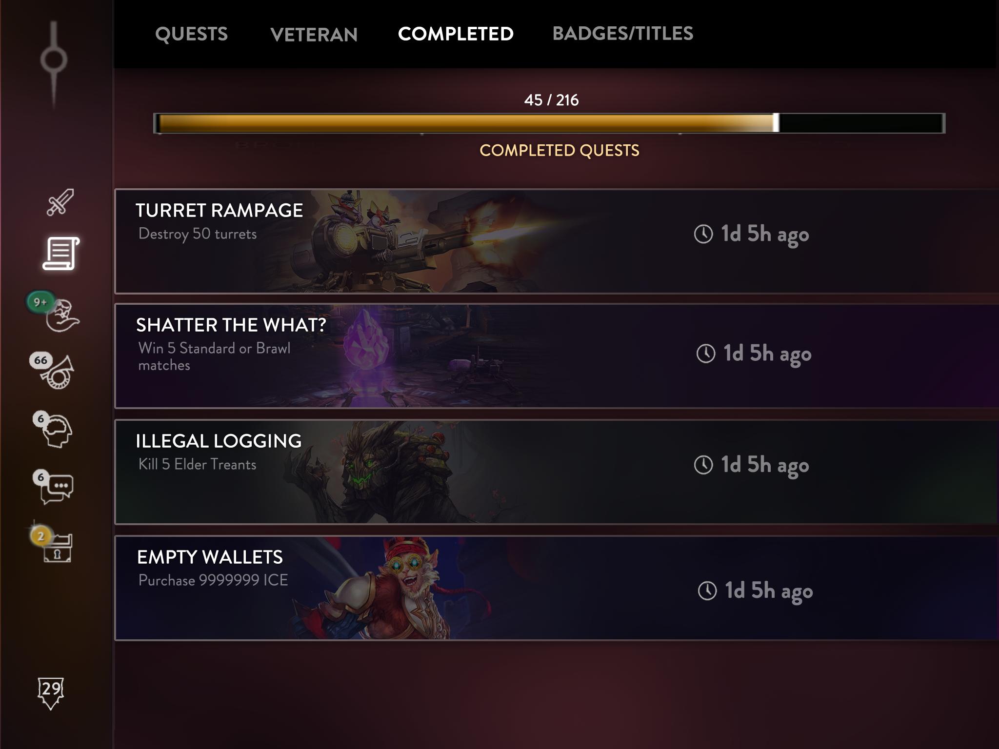
All your completed quests appear here. You also get to see when you completed them. After years of grinding, you can go back to this room and say to yourself, “wow I accomplished so much in life my parents must be so proud of me what a bright future do I have ahead of me!!”
I really believe that Quests can bring a whole ‘nother level of grind-y fun to Vainglory. It gives players an incentive to play aside from ranking. Casual players who don’t have the time to rank have something to slowly grind for! It also increases the F2P element to the game. Someone can definitely expound on this better. #I A I N ’ T N O W R I T E R. It certainly does increase the circulation of money supply in-game, which is a problem I guess? IDK am not an ec0n0misist either!
That pretty much concludes this thread! I hope you guys like this suggestion!
Link to Vincitore’s Quest Room thread : http://forums.vainglorygame.com/index.php?threads/131749/
I have more ancestral screenshots of VG in my iPad. I’ll place ‘em in the spoiler below. The oldest screenshot dates back to June, 2014. The old match screen is there as well. Check em’ out if you like.
The Old Stuff

Yeah. Keep Petal in Lane, guys. Also, the healing aura though </3. You will be missed. I also appreciate Ringo’s name here.
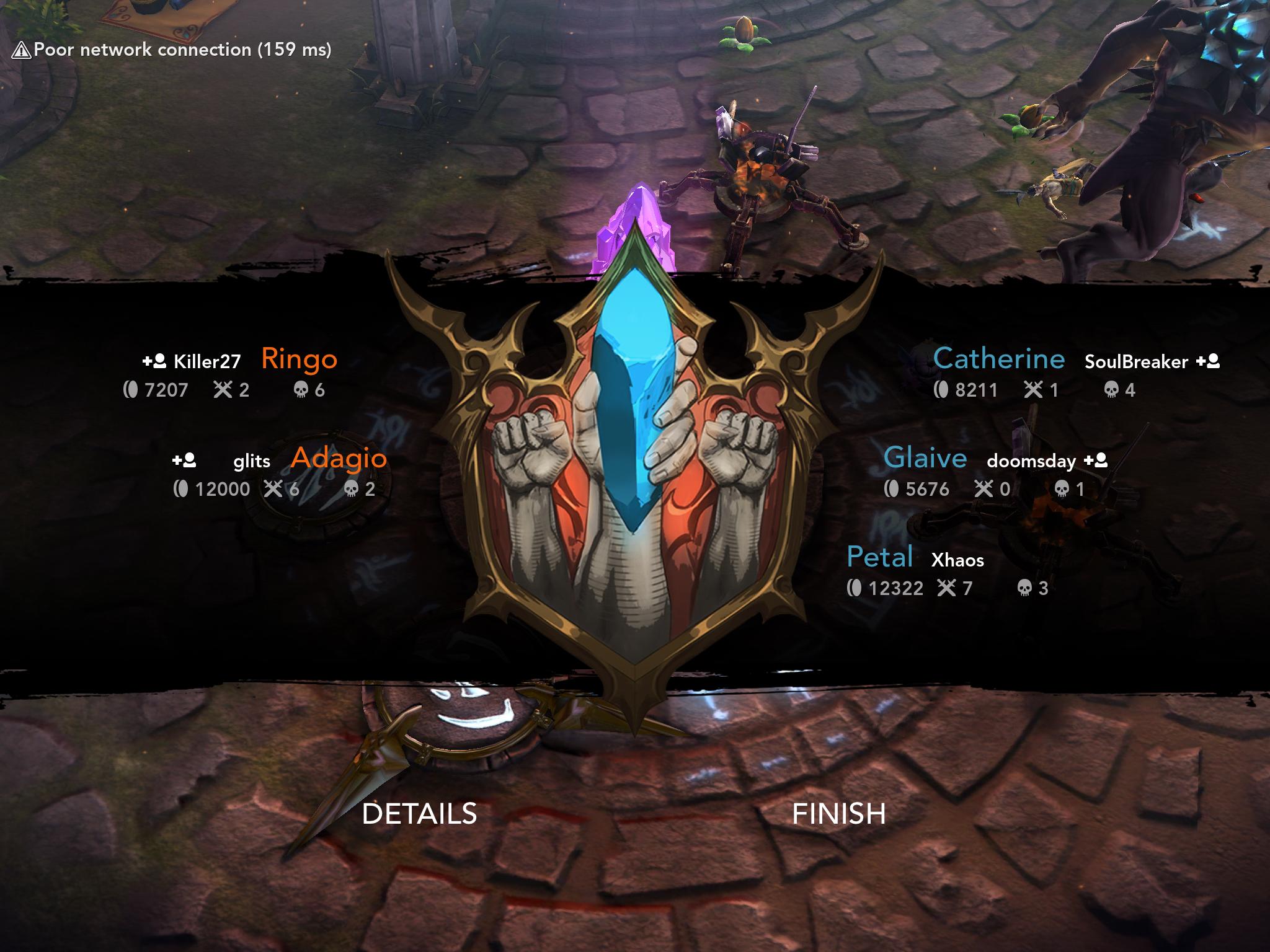
If you wonder who took the names “SoulBreaker” and “doomsday”, here you have 'em.
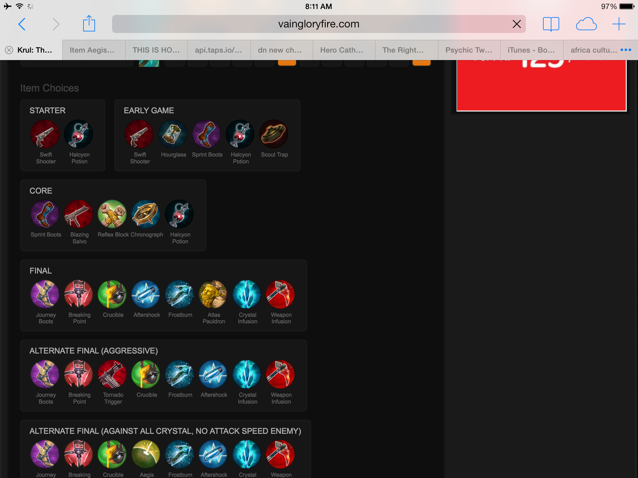
W0W I love this Krul build!
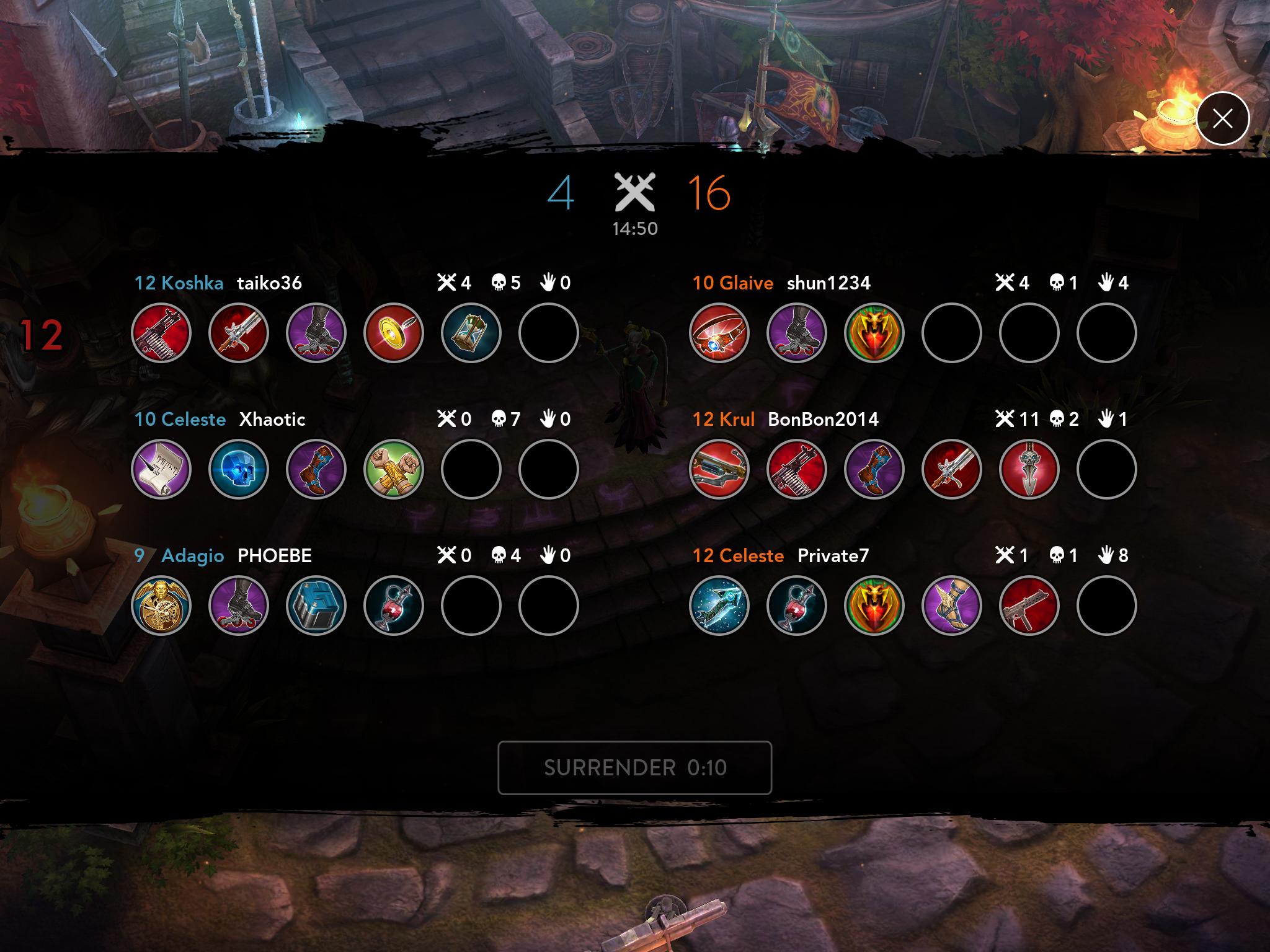
“PHOEBE” is taken here too. And OG Ironguard Contract <3
Sorry if those were boring. True entertainment lies in my Vox threads! #shamelessplug
Also, if you want “leak” versions of these just for the lols and the keks, just say so!
:oldskoolRofl: Thanks for taking your time and reading this thread!:oldskoolParty:
Once again, thanks @Vincitoria and @idmonfish!
